Posts in Our Work
Western Whimsy Meets Romantic Elegance :: Mae's Ridge Open House in Austin Texas
 
Vintage Cowboy Wedding Invitation
 

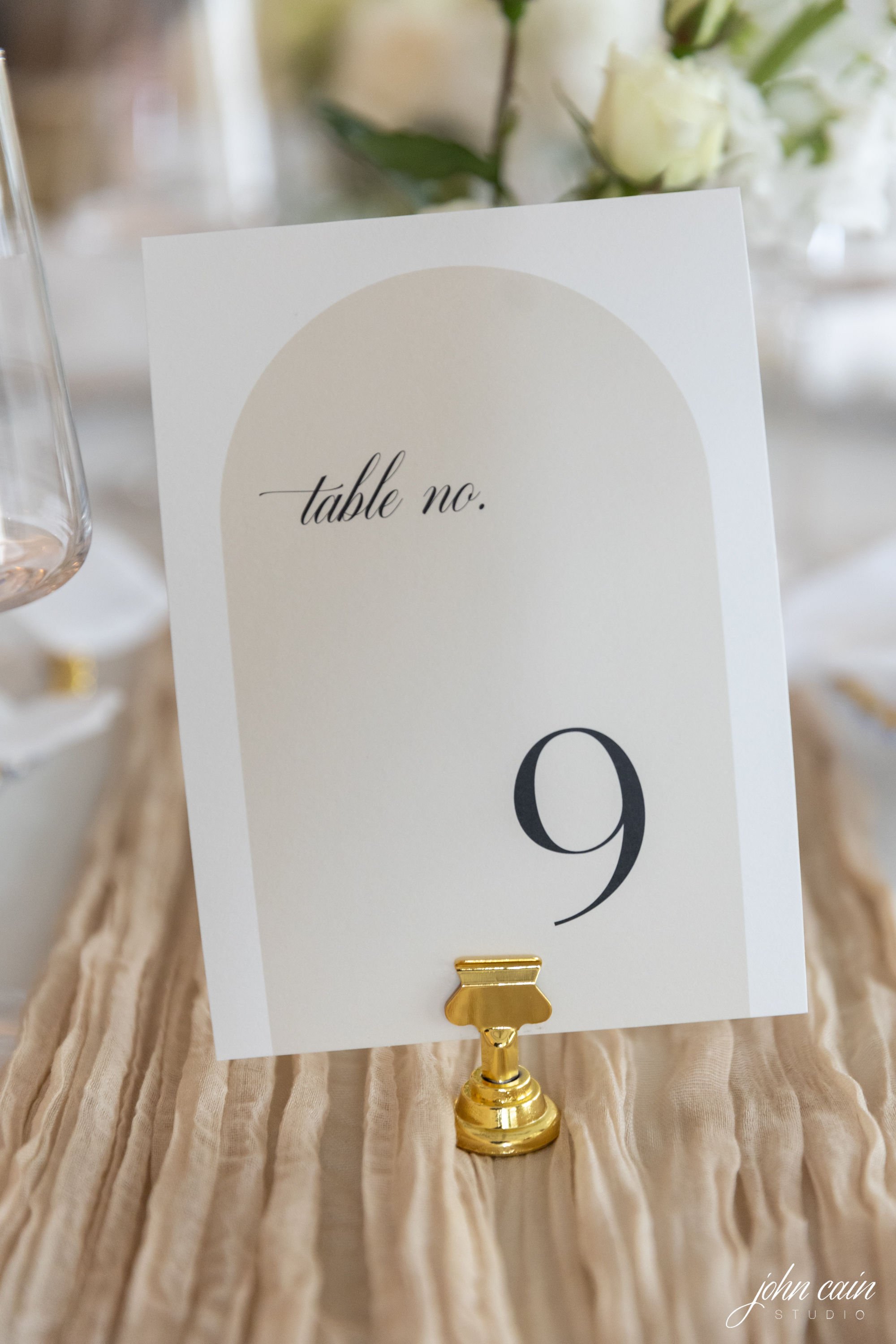
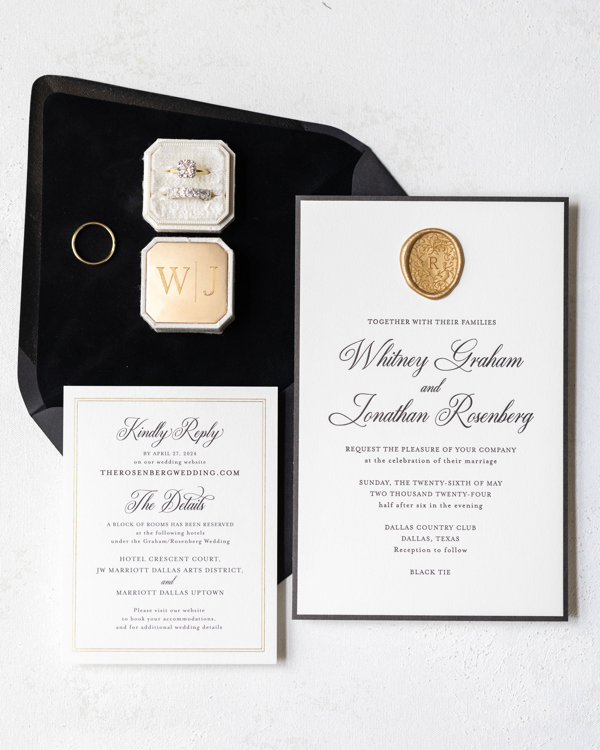
Western Whimsy Meets Romantic Elegance: A Texas-Inspired Wedding Invitation Suite. When it comes to setting the tone for your wedding, few things speak louder than the invitation suite. Infused with vintage western charm and soft romantic hues, this Texas-inspired custom wedding invitation suite is a dreamy nod to both tradition and personality.

From the vintage inspired illustrated cowgirl envelope liner to the custom boot die cut details card, every piece is a love letter to the a western theme wedding. The palette of dusty rose, blush, and soft mauve pairs perfectly with vintage postage and feminine typography, creating a cohesive look that feels both nostalgic and fresh.

We love how playful touchesβ€”like the retro pin-up cowgirl and bold cactus stampsβ€”are balanced with elegant script and floral accents. It's a beautiful example of how western-themed design can be elevated with thoughtful styling and modern details.

Whether you’re planning a ranch wedding, a city soirΓ©e with Southern roots, or simply want your invitations to reflect your heritage and heart, this suite is the perfect blend of personality and polish.

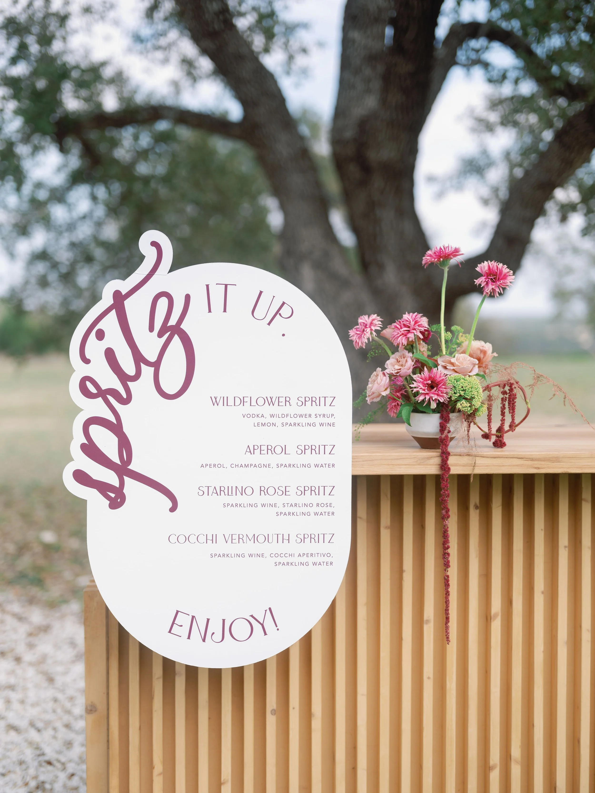
We loved creating the custom wedding bar sign mounted to the bar for all guests to see. And seating chart installation with cowboy hats, leather strips with custom calligraphy by Jennifer Smiley with 3J Designs.

Thank you vendors:

Sarah Tribett Photography, betts and Co events, Mae's Ridge, ​Officially Oaks, peak bev, hill country jennies, royal fig, vestals catering, creature coffee, imperial floor rentals, the cupcake bar, dart-collective, daughter floral, sunny hair and makeup, stradley davidson, Vannagram & Co., loot rentals, ​Sparks & Co. Events, sienna strings, noma events llc, vida film production

 
Our WorkKelly McGraw
Iris and Ty :: Natural Green Inspired Wedding at Woodbine Mansion
 
Custom Round Wedding Menus with Illustrations
 

Loved working with Iris and Ty for their gorgeous greenery inspired wedding at Woodbine Mansion in Austin/Round Rock, Texas. Creating their menus and seating chart display was such a highlight!

Forget the standard rectangle! Round menus bring a soft, sculptural element to your table design. They sit beautifully onto charger plates or dinner settings and immediately set your event apart. With the right illustration, a round menu can feel like a piece of custom stationery and a keepsake for guests.

If you want your guests to have a "wow" moment right from the start, an extra large seating chart installation is the way to go. Think: a grand, oversized wall, a freestanding sculptural display, or even multiple panels that guide guests into the reception space.

Custom round menus, oversized seating charts, and wax-sealed escort cards aren’t just trends β€” they’re ways to create a layered, luxurious experience for your guests. Each touchpoint is an opportunity to tell your story, honor your style, and set the tone for the day ahead.

Thank you again for this amazing team!

Thank you vendors:

Tia Trapuzzano

Events by Mackenzie

Woodbine Mansion

 
Our WorkKelly McGraw
Callan and Chris :: A Garden-Inspired Invitation Suite at the Arlo Austin
 
Green Watercolor Florals Custom Wedding Invitations
 

We loved working with Lexie with 787 Events and Callan and Chris for their save the dates, invitation suite, and coordinating custom day-of stationery. There’s something truly timeless about a custom wedding invitation suite that brings the beauty of nature into its design. This recent suite we created is a perfect example of how floral elements, thoughtful print techniques, and custom details can come together to set the tone for an unforgettable celebration.

At the heart of the suite is the invitation card itself, delicately adorned with colorful florals that frame the couple’s names and wedding details. The soft botanical motifs add a touch of romance, making the card feel like a page out of a storybook garden. Printed using classic letterpress with green ink, the text has a deep, tactile impression that adds richness and dimension to the design β€” a detail guests will feel valued and set the appropriate tone of the wedding day.

Nestled inside a rich green envelope, the invitation is complemented by a coordinating envelope liner featuring the same floral artwork. The liner adds a layer of surprise and elegance, greeting guests with a bloom of color the moment they open the envelope. To top it all off, the addresses are printed in crisp white ink β€” a modern and striking contrast against the green envelope and a stylish nod to the suite’s botanical palette.

One of our favorite elements? A custom-illustrated map insert, complete with watercolor icons and landmarks that highlight key locations for the weekend. It’s both practical and personal, giving guests a peek at the festivities to come and adding another touch of storytelling to the suite.

And because every detail matters, the rehearsal dinner insert features its own floral design to echo the main invitation, tying the whole suite together beautifully. The coordinating florals across all pieces create a cohesive experience from start to finish β€” one that’s elegant, inviting, and distinctly the couple's own.

This suite is proof that when artistry meets intention, the result is something guests will treasure long after the big day.

To carry the personalized details into the wedding day itself, we designed custom matchboxes β€” a charming and functional favor guests could take home. At the bar, a custom sign featuring a watercolor dog illustration of their beloved pup added a playful, personal touch, perfectly paired with coordinating koozies that kept drinks cold and spirits high. The dinner tables were adorned with floral menus tied with soft silk ribbon, adding a layer of elegance to each place setting. And to guide guests to their seats, a dusty blue seating chart display stood out in the most graceful way β€” both beautiful and practical, tying in effortlessly with the suite’s color palette and overall design story.

Thank you vendors: 787events, thearlo, crave-catering, specs, Caroline Lima Photography, ohhappydaybooth, texasprodj, terravistastrings, AdoreMakeup, iliosproductions, whimhospitality, premiereevents, lootrentals, tablemannerstx, centerstagefloors, remiandgold, simonleebakery, pinkchampagnedesigns, bigdogpyro, alphalitausti, around-austin, atxclassiccars

 
Our WorkKelly McGraw
Maddie and Steve :: A Wedding with a Cheerful Splash of Color at Camp Lucy Austin


When it comes to setting the tone for your big day, your invitation suite is the first glimpse your guests will have into the celebration aheadβ€”and this one is all about joy, personality, and fun color.

This particular suite for Maddie and Steve is a dream for couples who love to do things a little differently. Think: a kaleidoscope of cheerful hues, a bespoke watercolor monogram featuring the couple’s beloved cat, and lush floral illustrations that feel like they were plucked straight from a summer garden.

From the moment you open the envelope, the invitation suite bursts with personality. Gone are the muted tones and minimal designsβ€”this suite leans into COLOR in the best way. Punchy pinks, sunlit oranges, vivid blues, and fresh greens all dance across the paper in a playful, coordinated palette. Every elementβ€”from the save the dates to the RSVP cardsβ€”feels like a mini celebration on its own.

At the heart of the suite is a custom watercolor monogram unlike any other. Nestled between delicate vines and florals is the couple’s sweet gray tabby, rendered in charming watercolor with just the right mix of realism and whimsy. It’s a personal nod to their furry family member and brings a cozy, heartfelt touch to the entire suite.

The monogram isn’t just limited to the invitationβ€”it was carried through to the envelope liners, wax seals, and even the cocktail napkins for the big day. It became a true signature element of the wedding design.

Watercolor florals weave their way throughout the suite, bringing in texture, movement, and an organic feel. Inspired by the couple’s garden-style wedding, the florals include peonies, ranunculus, and wildflowers in vibrant, saturated tones. They spill across the details card, wrap the border of the invitation, and peek through translucent vellum wraps like a blooming secret.

To tie it all together, the suite was packaged with a soft pink blush silk ribbon with coordinating soft blush wax seal.

This suite is proof that wedding invitations can be equal parts elegant, personal, and joyfully unexpected. It’s a celebration on paperβ€”one that reflects the couple’s love, their story, and yes, even their cat.

To tie the custom wedding invitation suite to their day-of stationery, we included their custom wedding monogram on the table numbers and their beautiful cheerful florals on the wedding menus, custom seating chart, and more.

If you're dreaming of an invitation suite that feels like youβ€”bright colors, beloved pets, or anything in betweenβ€”custom design is the way to go. It's a chance to infuse every detail with meaning and magic. Because your love story isn’t one-size-fits-all. Your invitations shouldn’t be either.

Thank you vendors:

Photo: @thecrakes

Planning: @pearleventsaustin

Venue: @camplucyweddings

Floral: @stemsofatx

Beauty: @lolabeautyatx

Stationery: @pinkchampagnedesigns

Linens: @bbjlatavola
Lounge: @lootrentals

Dancefloor: @centerstage_floors

Cake: @michellespatisserie

Band: @loveandhappinessband

Ceremony/Cocktail: @moontowerentertainment

Transportation: @uptownvalet

 
Our WorkKelly McGraw
Whitney and Jonathan :: A Luxury Wedding at Dallas Country Club


We were honored to work with Whitney and Jonathan for their lux black and white-themed wedding at Dallas Country Club, layered with abundant florals and refined elegance.

The invitation suite is timeless, dramatic, and sophisticated, designed to reflect the grandeur of a formal, black and white wedding. The focus is on rich textures, classic typography with modern flair, and thoughtful layering of elements. The wedding invitation was printed digitally on a card stock that is thick, double-weight cotton cardstock in eggshell white. The font is a mix of high-contrast serif fonts (for readability and formality) paired with ornate flourished calligraphy for names and key details. The wedding envelope is a deep black matte envelopes, with a smooth or slightly textured finish (like vellum or cotton paper). The custom wax seals is a processo gold wax seal for an added luxury look and for a bit of shine.

For their day-of stationery, we coordinated the design for their wedding reception menus with names printed on the menus for a personal touch and seating assignments at the tables. We also designed their wedding table numbers with an arch design, custom fan accordion fans for the wedding programs, custom cocktail napkins, drink stirrers, custom pet portrait bar signs, guest book sign, wedding welcome itinerary, wedding welcome notes, shabbat menus, and custom wedding pizza box stickers. For the escort card wall display, we printed guest names on envelopes so guests could open their personal messages inside each envelope.

We loved designing this wedding with Whitney and team!

Thank you vendors: John Cain Photography, Dallas Country Club

 
Our WorkKelly McGraw
An Evening at Jo Malone at the Domain Austin
 
Bow Wedding Bar Menu
 

At Pink Champagne Designs, we believe that every detail contributes to an unforgettable event.

This partnership is a perfect fusion of refined aesthetics and seamless event execution. Jo Malone, known for its timeless fragrances and elegant ambiance, set the stage for a sophisticated affair. To enhance the experience, we provided beautifully designed event signage that not only guided guests but also elevated the event’s overall aesthetic with Noma Event Rentals.

Why Signage Matters

Event signage is more than just practicalβ€”it’s an extension of the brand and the experience. For this event, we created a classic black and white custom bar sign with signature cocktails for weddings and events, welcome sign with real black ribbon adhering to the top with our black box for wedding signs to display the grand welcome sign, and minimalist place cards at each place setting. We focused on:

  • Aesthetic Harmony: Signage that seamlessly blended with Jo Malone’s sophisticated brand identity.

  • Guest Experience: Clear and stylish wayfinding that enhanced the flow of the event.

  • Brand Presence: A subtle yet impactful showcase of our partnership and dedication to excellence.

Looking Ahead

We are excited about future collaborations that bring together the best in event design and execution. Whether it's luxury signage, bespoke rentals, or immersive brand experiences, we look forward to continuing to craft memorable moments.

Stay tuned for more updates, and if you're looking to elevate your next event with beautifully branded signage, let’s create something extraordinary together.

Thank you vendors:

Planner| Betts & Co | Taylor Betts | @bettsandcoevents

Florals | @daughterfloral

Venue & Host | Jo Malone London Boutique - @thescentofatx

Rentals & Host | NOMA Event Rentals | @noma_eventsatx

Photography | Sarah Tribett Photography | @sarahtribettphoto

Furniture Rentals | Party at the Moontower | @moontowerrentals 

Linens | Stradley Davidson | @stradleydavidson

Signage | Pink Champagne | @pinkchampagnedesigns

Bartending | Chapter Social + Spirits | @chapter.tx 

Alcohol | High Desert Cactus Vodka | @highdesertvodka

Charcuterie | Charcuterie Mix and Co | @charcuteriemixandco 

 
Our WorkKelly McGraw
Kristin and John Michael :: A Romantic Spring Floral Wedding at Hotel Crescent Court


A Custom Wedding Invitation Suite with Monogram, Florals, and Luxe Details for Kristin and John Michael’s wedding at Hotel Crescent Court.

Your wedding invitation suite is more than just paperβ€”it’s the first impression of your big day, a glimpse into the style, romance, and personality that define your celebration. For couples looking to set a tone of timeless elegance, a custom-designed invitation suite with intricate details can be the perfect way to capture the essence of their love story.

A monogram is a classic yet deeply personal touch for any wedding suite. Whether incorporating the couple’s initials in an ornate script or a minimalist design, it instantly adds sophistication and a bespoke element. For this sweet couple, we designed a delicate monogram that seamlessly intertwined the couple’s initials, framed with subtle botanical flourishes to enhance its charm.

Adding an envelope liner is a beautiful way to infuse artistry into your stationery. For this suite, a floral envelope liner was custom-designed to feature soft watercolor blooms that echoed the wedding’s floral arrangements. These hand-painted florals in muted pastels and lush greenery created a dreamy, romantic aesthetic, setting the stage for the wedding’s overall theme.

To bring a tactile and luxurious element to the suite, we wrapped each invitation in a delicate lavender silk ribbon, complementing the soft florals while adding a touch of romance. Sealing it all together was a gold wax seal, featuring the couple’s monogram, for an old-world charm that exuded sophistication and grandeur.

Every detail in a custom invitation suite mattersβ€”from the choice of paper to the finishing embellishments. This suite’s combination of monogram elegance, hand-painted florals, and refined accents created an unforgettable first impression for guests, hinting at the beauty and romance that awaited them on the wedding day.

Thank you, Kristin and John Michael for trusting us with your beautiful wedding invitations!

Thank you vendors:
Photo: @thecrakes https://thecrakes.com/
Planning and Design: @eventsbykristin https://eventsbykristin.net/
Venue: @hotelcrescentcourt https://www.crescentcourt.com/
Hair and Makeup: @the_styling_stewardess https://www.thestylingstewardess.com/
Floral: @venusandcoflowers https://venusandcoflowers.com/
Lighting: @absolutelighting http://absolutelightingdfw.com/
DJ: @leforcedj @justin.thedj https://www.justinthedj.com/
Ceremony Strings: @serenatastringsdfw https://serenatastringsdfw.com/
Videography: @soulboxfilms https://soulboxproductions.com/
Bakery: @fancycakesbylauren https://fancycakesbylauren.com/
Rentals: @bellaacento https://bellaacento.com/
Stationary/Invites: @pinkchampagnedesigns https://www.pinkchampagnedesigns.com/
Dance Floor: @centerstage_floors https://centerstagefloors.com/

 
Our WorkKelly McGraw
Laura and Sam :: A Romantic Wedding at Laguna Gloria Austin
 
Blue Letterpress Wedding Invitation
 

When it comes to wedding stationery, the design is more than just paper and inkβ€”it’s an introduction to your celebration, a preview of your love story. Few designs capture timeless charm and bespoke artistry as beautifully as a blue letterpress invitation paired with watercolor details. Let’s take a closer look at how this stunning combination brings sophistication and personality to your big day.

Letterpress printing is a centuries-old technique that combines texture, depth, and elegance. For this design, we’ve chosen a classic blue inkβ€”think French blue or soft periwinkleβ€”to convey a sense of calm, grace, and tradition. The crisp impression of the letterpress, with its tactile quality, enhances every detail of the typography and design. Whether your aesthetic leans modern, classic, or somewhere in between, the blue letterpress provides a versatile foundation for your invitations.

To add a personal and artistic element, a custom watercolor map is included as part of the invitation suite. This map isn’t just functionalβ€”it’s a piece of art. It highlights key locations for your celebration, such as your ceremony venue, reception site, and perhaps a favorite local spot or two. The soft washes of color complement the letterpress design, creating a cohesive yet dynamic look. Watercolor maps are especially popular because they add a whimsical, bespoke touch that your guests will treasure.

Every invitation deserves a grand entrance, and that’s where the envelope liner comes in. This suite features a watercolor venue illustration printed on the liner, echoing the style of the map. Imagine a hand-painted rendering of your ceremony location, a romantic chapel, or a scenic vineyardβ€”it’s the perfect way to set the tone for your celebration as guests open their invitations.

The liner creates an unexpected moment of delight and further reinforces the artistic feel of the suite. It’s a subtle but impactful way to add a personal touch to your wedding stationery.

Thank you, Laura and Sam for trusting us with your beautiful wedding invitations!

Thank you vendors: Venue: @thecontemporaryatx
Planning + Design: @jodiwycoffweddings @36thstreetevents
Photographer: @frannypullinphotography
Videography: @lonaweddings 
Florist: @idamayesfloral
Catering: @laperaaustin
Rentals: @brighteventrentals @tablemannerstx @bbjlatavola @premiereeventstx
Entertainment: @ mikaelakahn @texassunmusic @royaldukesband
Dance Floor: @imperialfloors
Lighting: @atxeventsystems
Invitations: @pinkchampagnedesigns
Day of Stationery: @lydiamariedesign
Hair and Makeup: @beautybymaty
Cake: @sweettreetsbakery
Getaway Car: @atxclassiccars
Dress: @viviennewestwood @daniellefrankelbride

 
Our WorkKelly McGraw
Loren and Zach :: A Dreamy Wedding at The Hillside Estate in Texas
 
Wedding Welcome Sign on Gold Mirror with White Vinyl
 

From the moment we learned about the couple’s wedding plans at The Hillside Estate, we knew the invitations needed to reflect both the grandeur of The Hillside Estate and the intimacy of their love story. The bride and groom envisioned a timeless, romantic aesthetic with soft florals and a neutral color palette that mirrored the estate’s natural beauty.

We began with a custom watercolor illustration for the wedding invitation of the venue itselfβ€”The Hillside Estate’s iconic white facade framed by lush greenery. This artwork became the centerpiece of the invitation suite, tying all the elements together. We printed on lux cotton paper using digital flat print printing method to make sure the watercolor was printed beautifully.

For their day-of stationery and signage, Loren rented our large mirror and medium mirrors. The large gold antique mirror displayed seating chart cards with gold wax seals. The smaller medium gold antique mirror had welcome in vinyl displayed, greeting guests when they arrived.

The digital printed wedding table numbers with our gold table number stand holders and menus complimented and completed their wedding stationery. Congratulations Loren and Zach!

Thank you vendors:
Planning | In Reverie | @inreverieweddings

Venue | The Hillside Estate | @thehillsideestatetx

Catering | Blue Fire Total Catering | @bluefiretotalcatering

Floral | Twigs & Twine | @twigsandtwineevents

Photography | Amber Watkins Photography | @amberwatkinsphoto

Videography | Paradigm Pictures | @paradigm_pictures

Hair and Makeup | She is Art Beauty | @sheisartbeauty

Ceremony Music | Serenata Strings | @serenatastringsdfw

Live Band | Manhattan Band for Jordan Kahn Orchestra | @jordankahnorchestra 

Staging | Big D Rentals | @bigdpartyrentals

Marquee Letters | Alpha Lit | @alphalitletters

Flower Wall, Tabletop Rentals, Linens | Royal Event Rentals | @royaleventsdfw

Event Branding | Pink Champagne Designs | @pinkchampagnedesigns

Bartending | Mama's Medicine | @mamasmedicine.cocktails

Fireworks | Pyrotex | @pyrotexus

Cake | Sugar Bee Pastries | @sugarbeepastries

Ice Cream | Soft Swirlz | @softswirlz

Getaway Transportation | Toast & Coast | @toastandcoastdfw

 
Our WorkKelly McGraw